Join Club
BR RoundTable
Check Your E-Mail
Join ICQ
Contact Us

The Online Blade Runner Fan Club


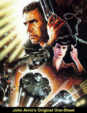
"John Alvin first contacted BladeZone in December 2000 as a reader of our Off-World Newletter and we jumped at the chance to interview him. For those of you who don't know, John Alvin is the artist who painted the original "Blade Runner" movie poster. After more than a year in the making, BladeZone presents my exclusive interview with John Alvin."--Aaron Brinkley
A.B.: First of all, I'd like to thank you for agreeing to do this interview with us.
John Alvin: Well, it's really my pleasure. I was directed to BladeZone, I really didn't know that you guys were around and a friend of mine said 'Go look at BladeZone.' And you had a couple of very comprehensive notes there on the new Blade Runner piece that I had done, and I said 'Hey, these guys are sharp!'. (both laugh) So it's really my pleasure.
A.B.: Well, thank you. We really don't know much about you, so perhaps you could start out by telling us about where you're from, your education, that sort of thing.
John Alvin: Alright. Well, I was born in the east in Massachusetts, but my father was a military officer so I lived a lot of places over a lot of years including 5 years in Germany, which was an interesting experience. We ultimately headed to California and that's always felt like home even though I'm still drawn to the east. I've been an artist all my life. I was always the kid that got out of class in high school, you know, to go paint sets for the play. I'd always draw pictures of women and airplanes for all my buddies cause I could draw things that they liked.
Somewhere along the line, I decided I wanted to be a doctor. I think it was that everyone had discouraged me from really attempting a career in the arts. No one felt that that was a real viable thing to do at that time, I'm talking about the mid-60's. So I fell victim to that and declared pre-med as my major. Of course, that lasted about as long as my first full-length class in Chemistry 1-A. And I floundered around for a while and fortunately was not drafted at the time. The draft for the Viet-Nam war was very heavy. I stayed in school and ultimately talked to my folks and they agreed they would help me foot the bill and I wanted to go to art school. So I went to Art Center College of Design, which still even today, although I have HUGE philosophical disagreements with them, they're still the school to prepare somebody for any sort of career in commercial art. I graduated there in 1971, and at that time everyone
A.B.: How does an artist get chosen to do work for a certain movie? Is he chosen by the director or by the studio?
John Alvin: That is actually a fine and astute question that most people don't really think to ask, and I appreciate you asking it. It's not an easily structured answer but I'll be as specific as I can. Very rarely does an individual artist get to meet with a film-maker. It isn't that they're necessarily kept apart, it's just that they are apart. By the time the film-maker is done, and let's say he or she has spent a year, two years, three years of their lives putting together some masterwork for the screen, they have to think about marketing the thing. They have to think about getting the public's attention with it. And it's sometimes the last thing on their mind and they depend heavily on marketing departments. What that amounts to is a group of hopefully skilled people that will come up with a strategy to sell the film to the public, to make the public aware of it. This includes buying television time, buying newspaper ads, magazine ads, if any. Just the whole gamut of every kind of publicity on the feature that's coming out. And somewhere in that milieu, someone decides 'Well we need to have a good poster.' And at that point usually a marketing department will come to someone like myself and ask for my services on either rendering an idea that they already have. Or coming up with an original idea of my own. And on rare occasion we actually get to sit down with the film-maker, who is the party that is going to have to be pleased in most cases. Especially the bigger name directors. So on occasion we get a little one-to-one contact, but not often enough. People like myself are usually hired and paid by a studio marketing department and their collective effort serves the interest of getting the film to the public. Also if you think about it . . . in post-production, by the time that some of these filmmakers are putting the finishing touches their film, that's right around the time that the studio wants the interest to grow. Right around the time that you want to start making the public aware. And the last thing these poor guys have on their mind is meeting with some artists or designers and talking about what the poster should look like. Unfortunately everything gets a little fragmented, but if you're lucky, it all holds together pretty well.
John Alvin: As I mentioned a bit ago, the first movie poster I did was "Blazing Saddles" for Mel Brooks. And that came about through a friend and an associate and a great designer named Anthony Goldschmidt. He had a job designing the title segment of "Blazing Saddles". And he came to me with the option of 'Hey, Mel Brooks isn't happy with anything the studio has shown him. What do you say we try out our skills at designing a poster.' So he had a lot of ideas and I had a good wrist, so I did that. One thing begat another and after a point, this same man, Anthony Goldschmidt, had opened a design studio called Intralink. They were very well known as a design studio in terms of making trailers and title segments for films. They had an opportunity to work on the trailers for "Blade Runner" and out of that came an opportunity to do a poster. And given that I had a long association with them, he called me. And I got to sit down with Ridley Scott, who is a terrific guy and a really very, very artistic director. So it came about just by having the association before and having performed before in that arena. Very often it's a question of who you know, not whether you're any good or not. So anyway that was what brought me to the assignment.
A.B.: Your painting is probably the most recognized piece of Blade Runner artwork in the world. How did that particular layout come about?
John Alvin: Well after a lot of different studies that I drew and designed in concert with the gentleman I mentioned, and under Ridley Scott's scrutiny . . . We had the pleasure of having Ridley Scott come over to the design studio and take a look. He was interested and he made the time to do it. Most of the original idea spotlighted Roy Batty. Which I still think is one of the most wonderful characters ever on film. And we kept being reminded by Warner Brothers and by everyone else that we have to show off Harrison Ford, we have to show off the Deckard character. We have to show him and we struggled with that a little bit till it became abundantly clear that this was a huge star. Of course at that point, we would have known him as Han Solo or Indiana Jones. And of course in "Blade Runner", he gets the crap beat out of him every fifteen minutes. (both laugh) So it wasn't quite the same heroic Ford, but it was the Ford face, nonetheless, that they wanted to see. So that changed the conceptual course of the studies and we ended up with about four pencil drawings. You know, about 11x17 inches, just black & white pencil drawings. And one of them was pretty much the basis of what you see in the original poster. It featured a large Deckard with his gun at the ready, and a small Rachael, and a kind of, almost forced-perspective of the city of Los Angeles as envisioned by Syd Mead and others. Syd Mead, by the way, is one of the unsung heroes. He really did a good deal to influence "Blade Runner" as a production artist. But in the final analysis, it seemed important to everyone to show off Harrison Ford as the key player and in the long run, Roy kind of got bumped out of the artwork altogether. Which always sort of distressed me, but that is the need of marketing, it's just a matter of making great art that shows off the film. Finally we came up with something that everyone liked and that's what you see as the original poster.
A.B.: I understand that the original painting was much larger than the posters and video tape boxes we all see. What has been cut out?
John Alvin: Well, you are correct. It is larger. A lot of imagery has been cropped off what you see on the DVD box or on the first run of the poster. The view down to the street way below of the city was a little more enhanced and in the foreground on the left side especially, there are pieces and parts of buildings, and hardware and tubing and nonsense and neon. A lot of stuff going on. And if it were all to be shown, it would have proportionately made Harrison Ford smaller. So there was the choice made at some point . . . It wasn't my choice, but I don't know who, when, where or how . . . the choice to sort of field in a little bit and crop out some of that stuff. It does show up periodically like sometimes in a British quad poster you'll see some of it. I remember an Italian poster, I don't know whether it was like a 2-sheet or a 3-sheet or what, it was posted around Rome, that had almost the entire painted image. So once in a while it'll show up but it's not too common.
John Alvin: Well, I was approached by 20th Century Fox consumer products merchandising to do that and I figured that fifteen years before all we knew was an egg and "In space, no one can hear you scream." And the scary thing about "Alien" was how little we saw the creature itself. It was always hidden, quick and deadly. Now though, I figured everyone knew what it looked like so let's not apologize for it, let's put him out there stepping through a portal, you know, about to kill you. I found some good references on it in Cinefex magazine and from my own files here, images I had kept around. I tried to make a really respectful portrait of the alien creature itself. I understand that Ridley wasn't terribly fond of it only because he felt that it gave too much away. This information came to me second-hand, I never spoke to him about it. And I felt badly that he might not have liked it that much, but I was doing what I was asked for in terms of merchandising, in terms of a product that Fox would sell. They never marketed it very successfully, I think. At Fox Consumer Products, I don't think the left hand knows what the right hand is doing, even today. And you can see proof of that just by how there isn't really a lot of ancillary product and merchandise support to any of their big sci-fi pictures, even now. It was fun to do though. I've always admired "Alien". I think it was a wonderful piece of work by Ridley and it was my chance to toy with the subject, so I'm still very pleased with it.
AB: You've done a lot of one sheets for animated movies. Are they easier to do than for live action movies?
A.B.: Yeah. I'm really impressed with the "Lion King" one-sheet with all the animals down below.
John Alvin: Well, I should say for clarity and in all fairness, the bottom part of that with all the animals is really a wonderfully enhanced frame of film from the feature and if I'm not mistaken , an artist at Disney, whom I do not know, actually did the enhancement. I did the huge lion in the sky and all that sort of larger-than-life kind of stuff that I tend to do, and originally it was just a bare landscape down below with a lion on Pride Rock in my painting. And the bottom part there with all the fine animals was literally computer assembled. In the final analysis, it's what Jeffrey Katzenberg wanted to see. He was still at Disney at the time. And it made a really fine combination. I was glad to see they used the lion alone in other things and for many other uses. But proper credit where it is due, I did the top part. (laughs)
And I'm really careful about that because I think it's very important for things not to be misunderstood. And we so rarely get name credit for what we do. I'm sometimes offended and appalled at what some artists will do to kind of claim, falsely, work that isn't theirs or by not correcting someone's assumption and let them assume that they did something that they didn't do. I mean, I've had that happen with artwork that I've done like the original "E.T." poster. I've had people claim that art without realizing that I was the guy who painted it just in talking to me. They may not even mean to be plagiaristic, but I've gotten to the point lately where I won't let them steal any of my thunder. I won't name names, 'cause I really don't want to get down in that rut and grovel around. I am the artist of record on a lot of really famous films. I'm very, very fortunate to have had those opportunities. "Blade Runner" is one of them. "Blade Runner" is something I will always show with great pride. Which is why I'm most grateful to you guys for giving me the chance to talk with you and make sure everybody knows that the name on the "Blade Runner" art is Alvin. Always has been, always will be. Including the new piece that I've done for "Blade Runner", which you guys picked up on right away. I was so impressed that you did. (Kudos to Gary Willoughby for bringing in that info!) May I tell you about that one?
A.B.: Yeah, sure.
A.B.: That seems to have happened with a lot of the Blade Runner props and stuff.
John Alvin: Yeah! It's like, 'Where is that?', 'I don't know. It's gone.' (both laugh) You know, I think that happens with films that are so artfully done like Ridley Scott's work. There was always a mystery about some of the Alien props and artifacts. They all kind of disappeared in weird ways and people walked off with them. I did some work on "Blade Runner" very early on that looked like the work of H.R. Giger, the wonderful surrealist who did so much of the production design for "Alien". And knowing that was what Ridley Scott had liked, I did some early logo studies of a snake, let us figure for the sake of the story, an artificial snake, crawling in and out of the lettering of "Blade Runner" with the spinners flying by and stuff, and it was all done in that kind of strange black & white surrealistic style that Giger does and it just . . . No one liked it! (both laugh) And that often happens, you take a bit of a risk and you make an artistic statement and the powers that be say "Naaah, we don't like that." But it's part of a large body of preliminary work that was done for "Blade Runner", some of which is still around. I have a few collectors and patrons that have collected some of those things from me over the years. Hopefully, I'll be able to publish them one day.
A.B.: It'd be quite interesting to see some of that work.
John Alvin: And some of it looks a lot, at least subject-wise, like what we know as the poster but it's just sort of re-arranging things. One of the early ideas featured that neat "Off-World" airship that hovering over the city, and a giant half-face, dramaticly lit, of Roy just sort of staring out at us from the darkness and a very small Deckard running along the street. You know, different ideas, little different looks, and as I said, it all had to funnel toward the growing Harrison Ford popularity. So that's why the final looks the way it looks.
AB: Your portfolio is quite impressive with such works as the "E.T." one-sheets and the Star Wars 10th Anniversary poster. What are some of your favorite pieces that you've done?
AB: Have you ever thought about doing any of the covers for the "Star Wars" book series?
John Alvin: I would love to do that. It's been sort of wrong time, wrong place or I've been working on something with too heavy of a deadline to do any of them. I would love to and in the future maybe I'll get a chance to. Those aren't things that we really get to choose. Someone decides 'I want this guy.' or 'I want that guy.' So I've missed out on those up till now. I'm hoping that does change in the future. I think there is a great future in specialized print images that hasn't been exploited yet. I've got my fingers crossed and hopefully I'll get to do that.
To get back to Blade Runner . . . Blade Runner is an interesting piece of work, and it lives on. It's almost twenty years ago that the film came out. I was very fortunate, as I said, to have had associations and to take advantage of those opportunities that allowed me to do the poster of record on it. That's certainly a pleasant piece of personal history. When I watch the film, and I watch it about once or twice a year, I'll put on my laserdisc and turn it up real loud and watch it. I'm fascinated. It is so wonderfully done, it's contemporary even now. And that, I think, is bizarre, when you think about how far movies have come in the last twenty years, it's a credit to Ridley Scott and a credit to the producers and whoever let it be what it was going to be. There has been a considerable amount of confusion on what is a 'director's cut' and what isn't. I had a brief experience at the early parts of the project that might be of interest to you. There is very often a rough cut and sometimes several rough cuts or assemblies. And sometimes some directors are very meticulous about rough cuts and they're almost indistinguishable from the final cut, even though they may be using temporary music or whatever. I saw Blade Runner in a rough cut that was about three hours and five minutes long, and I'm sorry to this day that they removed a single frame of it. I thought it was magnificent. And grisly, horrible death was a little more grisly and a little more horrible, and any wonderfully mysterious moment was a little more wonderful and a little more mysterious. It was artful and beautiful and carefully considered, of course, this is Ridley Scott at work. There was no voice-over and there wasn't a lot of Vangelis music playing and so on. It was a rough cut and boy, it was magnificent.
AB: Do you ever wish your artwork got more recognition?
John Alvin: For me as an artist, I know that whether I do really good art or not for a film, sometimes I'm riding the coattails of the film , and that's allright. It's okay that people would notice my art because it's a hugely successful film. And sometimes one ends up doing great artwork for films that aren't successful, and the artwork therefore doesn't get recognized. I think that movies are such a fabulous, unique, and emotional product and experience that sometimes we all get swept along to everyone's benefit and sometimes we all get trampled. In all the work that I've done, I've been very fortunate to have worked with good people, and sometimes directly, most times indirectly, with great filmmakers. And I'm hoping the trend of popularity photos shifts back a little bit. More and more, I'm being asked to develop work that looks like it used to be. And that's a good sign. At this time, I can't tell you what I'm working on, but I think that there's going to be a bit of a shift back to the originality and the artistry and the drama of movie posters, like the kind I tried to achieve in films like Blade Runner. So I'm going to keep my fingers crossed, and I hope you will too.
AB: Of course. Mr. Alvin, I'd like to thank you for taking time to do this interview with us.
John Alvin: My pleasure, Aaron, and I hope I've been of some interest to you and your fans. You guys do a great job and I'm delighted that you would have any interest in having me on there and I'll be available for anything you might need in the future. You've thanked me for my time and I really think that's a two-way street. I thank you for your time and attention and keep up the great work at BladeZone.
 was going back east to work in editorial or magazine illustration. And I looked around and I realized that I've always loved the movies. And the movies seem to be made in Hollywood, California. So it seemed to me that right where I was living and going to school there had to be work. And after a while I started finding it. One thing leads to another and pretty soon I found myself involved in a very different world than I had learned in school. Before I knew it, I was staying up late nights finishing a piece of work for a movie called "Blazing Saddles", which was the first movie I ever worked on.
 A.B.: How did you get the Blade Runner job?
 A.B.: You mentioned to me that you were unable to work with Ridley again on the Alien anniversary artwork. What's the story behind that?
 John Alvin: Well, there is something pleasing about animated films in that the animated film is artwork, per say as opposed to photography. And so artwork to sell artwork is kind of a natural way to go. And I love doing it, especially since so many one-sheets today are simply publicity shots of who's starring in the film. There's not a lot of art or design really involved. I've been very privileged to do a lot of work for Disney on some of their films over the last ten years and those are pieces I show with great pride. I've been able to take the subject of the film, let's say "Beauty And The Beast" or my "Lion King", and elevate it way, way beyond just a scene from the film or a single animated cel to almost a mythological or allegorical kind of view. Which I think is appropriate, I mean the power and dynamics of Disney animation is just unparalleled. No one comes close. Sorry, bad news for all the other studios who were trying, but no one comes close! (both laugh) The marketing staff at Disney has been very wise in reaching a broad audience. They know it's not just for children. So they've often asked me to do images that would appeal to more than just a young audience, it would appeal to the adults out there who want to see this stuff too. And I've been very fortunate to have some high-visibility pieces. I'm able to adapt my work and my style to suit, shall we say, part of the Disney magic.

 John Alvin: The new piece is really a personal work that is kind of the way I always wanted to do it. And you notice it has a large, dark image of Roy in the upper right, larger and more dangerous than anything else. And a new and revisited, much-improved image of Harrison Ford, I think a much more heroic look, even though he's still kind of sweaty and looks kind of rugged. And a brighter, more pristine image of Rachael and kind of improved detail on the buildings and a sense of atmosphere and everything. If you put the two side-by-side they're definitely cousins. But one's definitely older and wiser. (both laugh) We're always dependant on photographic reference in terms of rendering the face or pose of a movie star. I mean how else would we do it? These people don't pose for anyone. There is no such thing anymore. So I had, frankly, a lousy picture of Harrison Ford when I worked on the first one. I did my best and it came up okay. But I was always concerned about it. I always wanted to see it a little differently. And in doing the new one, I had collected and found some excellent pictures of Harrison Ford from that era. And I was able to be more specific about the nature of his stare and the little bits of stubble on his chin. You know, that wonderful, characteristic nose that he has, everything like that. So I was just able to upgrade it and light it a little differently. The way I always wanted to do it before anybody told me what I had to do. The new one also may find life as an anniversary piece of the film's 20th anniversary in 2002. It may find life as a licensed, limited-edition print that I would be signing. It may find life in many ways. I don't have any control over that. I really did it as a chance to kind of . . . you know, to revisit a subject not unlike George Lucas got to go back and do the Special Editions of Star Wars and Empire and Jedi. Obviously, this isn't that magnificent! (both laugh) Or on that scale! But in the same sense, a chance for the artist, in this case myself, to go back and recreate something that I always liked but wanted to do it a little differently at the time and circumstances didn't permit. So hopefully it will have a life of it's own. I was most appreciative that you guys were on top of it and saw it. I should point out that the original painting itself was purchased by a private individual in Singapore at an auction by Christie's Auction House. Without getting into the dollars and cents of it, because I think that would be a little crass, I will say that I'm pleased to note that it sold for the highest landmark price of any commercial illustration ever at Christie's. What I was delighted about, well certainly I made some money from it, but in an auction percentages go to different places, but in this case, it was an auction to benefit the USC Film Department. So I was really glad to be able to make some contribution to that film department that's produced so many great directors and film-makers. You know we retain any publishing rights on this piece, but the original is in a private collection. And curiously, the original that I did back in '82 is gone. Vanished. I don't want to say 'stolen', because that sounds criminal, but I don't know where it is and I don't have it. (both laugh) No-one seems to know where it is and it's always had a kind of mystery about it.
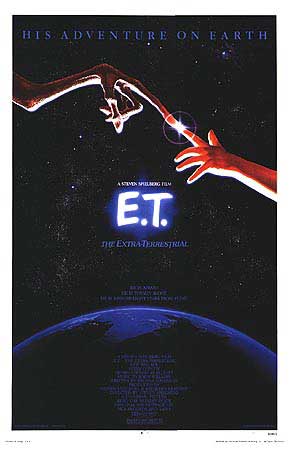 John Alvin: Well, you know, it's such a strange profession. I mean, I could down-play it and be humble with you and say I just work in advertising but the truth is this is the closest I could get to the movies I've loved all my life. I'm not an actor. I'm not a writer. But I get to do this stuff, and I've had some wonderful opportunities and I've taken advantage of those. I've had the privilege of doing all of the Mel Brook's art that people remember. I'll name those titles specifically . . . "Blazing Saddles", "Young Frankenstein", "Silent Movie", "History Of The World", and "Spaceballs". There have been other people that have done other pieces, but those pieces were meant to mimic what I was doing, because I didn't have the time to do it. I was able to establish a look, a kind of character with that. And fortunately, since Hollywood does typecast, I was able to escape the idea of just doing comedy. I've had the chance to do other things. I was able to work on "Blade Runner". The same year I did "Blade Runner", I did "Victor/Victoria", and "E.T.". I'm going on record with you, I am the guy that painted the original "E.T." poster with the two fingers touching. It's my signature. It's very tiny in the circumference of the Earth. I have had so many other artists claim this work, it's offensive. It's offensive how many people want to be on board, or will let people believe that they did this. All lies. All fabrication.
  I did the teaser poster for "E.T.", which was the lights from the ship coming down through stormy, multi-colored clouds. I did the opening campaign, the main campaign which is the two fingers touching over the Earth. And some years later, I did the re-release campaign where the two fingers were dealt with as stellar constellations. One year after the film was open, Universal released a poster of the bicycle in front of the moon. I had nothing to do with that. And that is a photo-composite from ILM. It is not artwork. They did that because . . . well that has become Spielberg's logo for Amblin of the kid in front of the moon. So it was a very logical thing to do, sort of as an anniversary. And I was very fortunate because of doing "E.T.", to have done more images for Spielberg films, than any other single artist. To name a few of the ones he has directed, I did the posters for "Empire Of The Sun", "The Color Purple", "Always", for "E.T." as I mentioned, and I also did an advance teaser poster for "Hook" that just featured the hook itself. And I've done a lot of work on stuff that is a Spielberg-oriented thing or an Amblin-oriented thing, I did the artwork for "Arachnophobia", "Cape Fear", for "Gremlins", I did a Style-B for "Goonies". So the work has been all over the place. I am very
  fortunate, and I want to stress that, to have had the opportunities and I have done well with the opportunities. Cause it's quite a showcase of stuff, I mean, my name is becoming better known and my artwork has been seen all over the place. And I'm very proud of everything I've had a chance to do. I hope I continue to get to do more. I did a lot of work for "Jurassic Park" but not the final. Not what finally came down. Steven Spielberg made a brilliant choice on that, I thought. Even though he wasn't going to use my work. Because the icon of the dino there in the circle was the same thing that was on the door of the Ford Explorer in the movie. It's the same thing in the gift shop in the movie. It leant a credibility to it that made it like a real place. I thought that was brilliant. I'm sorry again that I didn't do it! (both laugh) But the Spielberg films are, of course, great feathers in one's cap. I've done a lot of specialized work for George Lucas and for the "Star Wars" saga. I'm sorry to say, I've never been in the right place at the right time to do a one-sheet for any of the films during their release. But rather for anniversary pieces, or specialty celebration pieces through the
  international fan club and stuff like that. And I'm pleased to say that George Lucas has a variety of my paintings in his personal collection so I'm in good company there with people like Norman Rockwell. And I'm very grateful to Mr. Lucas that he 's responded to some of the stuff and has chosen to acquire it. You have to imagine how nice it is to have the guy that inspired the very stuff I'm painting, to have him respond to it and want to have it. I mean that's cool! He's a very generous man and a very talented, very intelligent man and I'm most flattered that he has that interest in my work.

John Alvin's Star Wars 10th Anniversary Poster
Be sure to read Gary Willoughby's article on John Alvin's "Blade Runner 2000" poster.